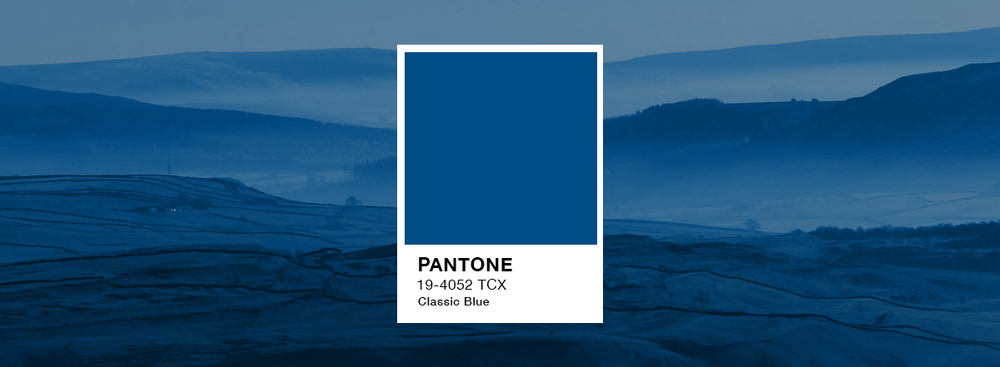
Pantone Classic Blue 2020
As we move toward the new year, many are thinking about new resolutions, new habits and new beginnings. But are you thinking about new colors? For the past 20 years, Pantone has chosen a Color of the Year to guide design trends as we dive into the future. And the official shade of 2020? Classic Blue (19-4052).
According to Pantone, the color is meant to instill “calm, confidence and connection,” as well as “highlight our desire for a dependable and stable foundation on which to build as we cross the threshold into a new era.”
The color is chosen based on trend analysis conducted by the company’s color experts, who examine both emotional trends and color influences in the entertainment industry, art, fashion, textiles and even popular events, like sports. But what does this celebrated color actually mean for the design industry? For two decades, Pantone’s annual Color of the Year has influenced product development in multiple industries, from fashion to home furnishings, industrial design and more. So get ready to see this dusky blue pop up in clothing, home goods, branding, high-end items such as cars and electronics, and of course, painted on the walls of houses across the country.

